Judging Books by their Covers
 For most adult readers, the cover of a book doesn’t matter much. But for struggling students, the book’s appearance is a top priority. Does it look like I’ll be able to read it? Does it look like it will be interesting? Does it look like the books all the other kids are reading?
Unfortunately, an unappealing cover can cause readers to overlook a really great story. In One Last Scar, the creepy-looking character on the cover, combined with the odd, lower-case Comic font in the title, might turn a some readers off. Yet it’s a really good story about a troubled teen who lives by a set of rules that lead to a moral dilemma at the end.
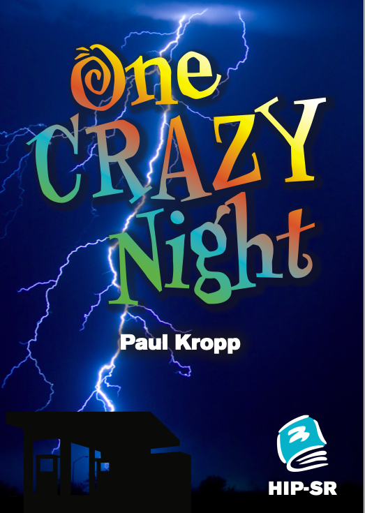
By contrast, the cover of One Crazy Night grabs our attention right away. The focus is clearly on the title, with bright colours and an uneven font, suggesting that this will be a fun – and maybe funny – read. This story is about a cast of characters stuck in a gas station convenience store during a thunderstorm. An image of lightning stretches down the page to the subtle silhouette of a service station at the bottom.
Blogger Gwyn Flowers identifies five elements to consider in designing a great cover:
- FIRST IMPRESSION matters. Covers should catch readers’ eyes and entice them to pick up the book and read it.
- LAYOUT should have a visual focus that conveys what the book is about, either focusing on the image or the title, as long as it doesn’t overwhelm the reader with too many design elements.
- IMAGES should be compelling and memorable, capturing the book’s essence at a glance.
- TYPEFACES can generate feelings, so the size, colour and design of the titles should support the theme of the book and genre.
- COLOR sets the mood of the text and directs the eye to the most important part of the cover.
Have your students analyze the covers of the books they are reading, using these five criteria. Better yet, have them create new covers that better reflect the content and genre of the book, as well as the design elements described above.
Send your students’ creations to us at info@hip-books.com and we might just feature them in an upcoming HIP TIP.


