Have you ever noticed that the kind of reading we do most in life is the kind we teach least in school?
FUNCTIONAL READING is the kind of reading we do in order to function in the world. It includes instructions, directions, maps, menus, recipes, schedules and advertisements.
READING POSTERS AND FLYERS
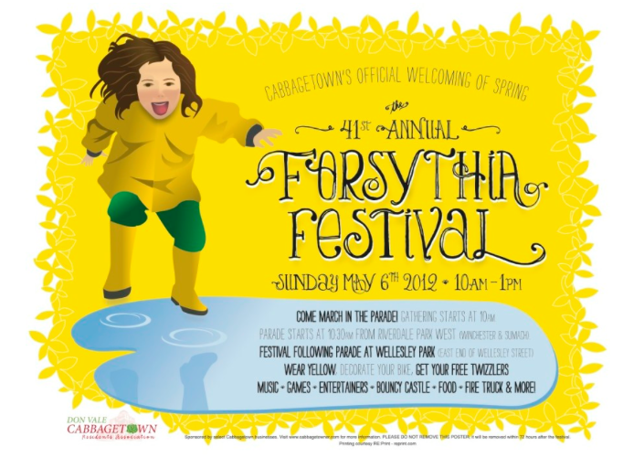
Flyers and posters are forms of functional text often used to advertise a special event, such as a school carnival or sidewalk sale.
The image on the left is a poster for an annual neighborhood festival. Click here or on the image to see several more posters for the same event over the years. Some were professionally designed and others created by children. You can use this collection to make comparisons, analyze the features of a good poster and discuss the strategies for reading this type of text.
Here are some discussion points for teaching students how to read, analyze and compare the set of posters:
What features do all the posters have in common?
- Very visual, with bright colors and large fonts
- Few words, with just key information
- The most important information is in the largest print
- Tells what, where and when
- Often has images as well as text
What is the purpose of these posters?
- to tell people about a neighborhood festival and make them want to attend
Who is the audience for these posters? How do you know?
- People in the neighborhood, families with kids
- There are lots of kids’ events listed
- It assumes that readers know what the festival is and where the park is located
Why is a poster a good text form for this purpose and audience?
- You can get all the key information at first glance
What makes reading a poster different from reading a page in a book?
- You don’t necessarily read left to right top to bottom; you read all over the page.
- You don’t necessarily read the words in order; the most important information jumps out at you first.
How are the kid-created posters different from the professional designs?
- less neat and organized (“busier”)
- kid printing rather than word processing
- focus on kid stuff at the festival rather than adult stuff
Which posters do you think are more effective and why?
- Answers will vary
What makes some of the posters more effective than others?
- The words are large, clear and easy to read
- The organization on the page looks neat
- They aren’t too “busy”; there’s more white space
- All the information is easy to find; there’s nothing missing.
- All the pictures and visuals are related to the topic


